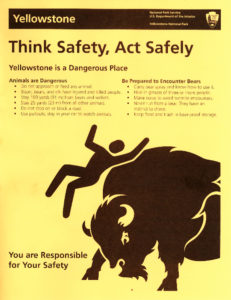
It’s happened again in Yellowstone National Park. This time the victim tossed into the air by a bison is Helvetica Man.
Helvetica Man, the international graphic representation of a human that marks almost every public men’s restroom, now is on the horns of a Yellowstone buffalo. You’ve seen Helvetica Man before — slipping on wet floors and falling over crumbling cliffs. His latest misadventure appears on thousands of flyers being distributed at entrance stations to the world’s first national park.
The faceless, emotionless Helvetica Man — who’s not only slipped and fallen but also competed every Olympic event from archery to swimming to discus — put a more soulful figure out of work. Millions of Yellowstone visitors will no longer be warned by the ubiquitous yellow flyer with an illustration depicting the bison-launched, Anguished Airborne Illustrated Tourist.
Gone is the Anguished Airborne Illustrated Tourist’s tousled hair, his flying ball cap, his doomed single-lens-reflex camera and his punctured hiking shorts. Gone is the Anguished Airborne Illustrated Tourist’s grimace.

Helvetica Man’s arms and legs flail as a new, also stylized, bison launches him. Helvetica Man’s back is arched by the force of the thrust. Helvetica Man’s head is snapped back by inertia as he’s propelled by the bison’s pointy horned charge.
But where’s the anguish? And where’s Helvetica Man’s cell phone that no doubt caused him to approach so close and turn his back to the wild beast?
Wilson artist Diane Benefiel offered a brief critique of the replacement of Anguished Airborne Illustrated Tourist by Helvetica Man.
“The guy’s face in the original one is more effective,” she said. “He looks like he’s getting killed, fearing for his life. The other one is just kind of cold and non-emotional.”
Will Yellowstone’s Helvetica Man work as a messenger? “I think we should have more blood and guts,” Benefiel said.
Helvetica Man was designed to “speak to international people,” she said, to be “more recognizable to a greater audience.” Such is the goal of graphic design.
“He doesn’t have a race,” she said. “He’s the universal man. He’s everyman. It’s the difference between an illustration and a graphic.”

Jackson filmmaker Sava Malachowski, who has made several safety videos on topics as varied as avalanches and winter driving, believes Helvetica Man will convey his message to most Yellowstone visitors. Most visitors, but not all.
“If you string enough of them side by side, someone might pay attention to them,” Malachowski said of the flyer. “They had these posters for years and it didn’t stop the last guy from being gored.”
The origins of Helvetica Man stretch back to Austrian philosopher Otto Neurath (1882-1945) who created easily decipherable icons for international communication. His isotypes (International System of Typographic Picture Education) took official hold in the U.S. when the federal Department of Transportation looked to aid throngs of visitors celebrating the country’s bicentennial in 1976. The American Institute of Graphic Arts, a trade group, and others participated. Designers Ellen Lupton and J. Abbott Miller nicknamed the figure Helvetica Man after a typeface that has a clean modern look.
Swiss typeface designers created the Helvetica font in 1957. Its name came from the Helvetii tribe that occupied the alpine land now known as Switzerland before the Roman conquest in about the 2nd century BC.
A collection of symbols from Helvetica Man’s world that are used in national parks can be found at the National Park Service’s Harpers Ferry Center website.


Hmm…. If the hapless/figure in the original graphic does not sufficiently represent a man/human to an “international” visitor I’d really have thoughts relating to interplanetary tourism! I think the old one was great and to offer “clarification” as the reason for the change is as lame as the depicted figure is soon to be!
Helvetica man and his bison pal would make an excellent graphic if they ever redesign the Wyoming license plate.
I’m sure there was a big crowd of other Helvetica symbols at the gored “old sign guy’s” funeral. May he RIP. And hopefully, I hope the NPS didn’t have to destroy
the bison who “gored” him…
Perhaps the beer swilling, shoeless Buffalo Wrangler of 2018 would lend his likeness for a poster. It sounds like he has a little time on his hands for a few sketches to be drawn.
We used to have an office pool each spring for the date the first tourist would be gored/tossed/stomped/mauled in Yellowstone.
A simple warning should suffice. He who does not heed the warning will pay the price. Life is like that…
Entertaining as well as informative article. I’m puzzled about one icon, however. I downloaded the PDF from the Harper’s Ferry site and it’s not there. The 9th from the end: ‘Wear full ballgowns?’ ‘Flamenco dancing here? ‘
What the heck is row three column two?
Diving
A snorkeler, a kind of diver,
Thumbs up for Helvetica Man In Yellowstone…Helvetica Man acts the fool in public places but has everyone’s best interest at heart and always takes the fall…super signage, so no excuses despite language differences!
I’ve always loved that old art so I made a shirt out of it:
http://designscott.com/?s=bison
Helvetica Man’s head isn’t just snapped back, it’s plumb detached.
It’s alright… no brains were harmed in the making of this idiographic.
There are no brains to harm. LOL. 😉
This is a good start but I think they need to make road signs along all the routes throughout Yellowstone in the same style, warning about animals and the hot water features. People take fliers, and then don’t even look at them because they’re looking out their window.